10 Things That Drive Me Crazy About iOS 7

I have never been a fan of updates.  When there's a weekly update from Microsoft, I cringe.  When there's an IOS update, my stomach sinks.  App updates can be frustrating too, as they happen so frequently.  I always end up thinking, what is this going to break this time?  No, Jon...it's supposed to make it better, I tell myself.  Doesn't help much though.  Although, I have been known to get excited about updates to my Angry Birds games.  And maybe Candy Crush.  

I am not one those early adopters of change.  When there's a new IOS update, I'll wait it out for a week or two.  Maybe three.  I like to see how it fares with the early adopter folks first.  To me, it's like chess.  Let the pawns go first.  If something's wrong with it, I'll hear about it eventually.  What's the hurry?  I like my turtle method of slow and steady just fine.  

I like Apple...don't get me wrong.  I like Windows too, but when I'm using my iPhone, I don't think of it as as Mac or Windows.  I think of it as a tool to make my life easier.  And I like it when I can make things just a little easier.  I'm all about small victories.  Having said all that, I recently updated to iOS 7.  I used it for a few weeks before passing judgment on too many things.  Personally, I don't like it.  I'll talk about some of the little things that drive me crazy, but I'll also mention what might work better, so it doesn't seem like I'm only dishing out the negative.  Ready?  Grab shell dude.  Find your exit buddy.

1.  Icons.  Blech...I liked the look of the older icons better.  These are flat, and almost lifeless.  There's no dimensionality to them.  I like that word, dimensionality.  Can we at least have an option in the settings to revert to the 'classic' icon look?

1.png

2.  Where's the clock?  (iPad only).  This is an app specific thing that should be better controlled.  No matter what app I'm using or game I'm playing, I want to see the clock at the top of my screen.  Sometimes I need to know if I've wasted an hour playing Candy Crush trying to clear jelly.  My iPhone does this.  Why doesn't my iPad?  

iPad screen on the left - iPhone on the right

iPad screen on the left - iPhone on the right

3.  Lock screen font is too thin.  That screen can be tough to see under certain lighting or with a busy photo wallpaper.  The numbers and letters for the time and date could be just a little bolder, so they're easier to read.  

3.png

4.  Photo organization.  This was a big one for me, in the way that it organizes your photos now by date and location.  Your collections look like one big jumbled collage.  I liked the old way better.  Just give us a little separation in those collection albums.  This is just sensory overload.   

4.png

5.  Alphabet in the contact screen (right side of screen).  What.  The.  Heck.  Seriously.  Start at the top...A dot D?  Really?  So everybody in between is a dot?  Now, look at S.  It's S dot U.  Apparently we needed that dot to signify T. That one drives me bonkers.  Just put all the letters back on there.  

5.png

6.  Music app.  If it ain't broke, don't fix it.  But if you're gonna fix it, don't put the shuffle and shuffle all setting RIGHT next to the fast forward button and the volume.  I can't count the amount of times I've turned my volume down by accident or turned shuffle off because of this.  Or, did I turn shuffle on?  Wait, let me look.  Ugh.

6.png

7.  App Store update section is too cluttered.  Honestly, I don't care what app I updated 2 weeks ago.  Just give me the list of the current ones I need.  Like before.

7.png

8.  Mail App.  Seems fussier and slower.  I don't know why, but it just does.  I blame the thin font again.   It's all in the details.  The devil is in the details my friends.  Perhaps a darker colored interface would look better.

9.  Voicemail app changes.  Again, if it ain't broke, don't fix it.  The old way was better.  Don't need the expanding window when I tap a new message.

10.  I'll end on a good note, instead of a bad one.  I love the flip up window that accesses the camera, flashlight, Apple TV, and calculator.  It gives you other things too, but those are the ones I use most.  Good on that one!  

8.png

Hope everyone had a great holiday weekend!

Engagement Photo Session: Jen & Pat

jen-3.JPG

A few weeks back, I was privileged enough to be tasked with taking my sister's engagement photos.  This was no easy feat.  And then of course, you put a giant German Shepard in the mix...it makes things just a little more interesting.  What I discovered was more challenging than I had originally planned.  

My sister hates it when I take pictures of her.  I mean, she will burn a hole in me with her eyes if she even senses a camera lens pointed at her.  So, naturally, when she specifically asked me to do it on purpose for her engagement photos, I jumped at it.  On the day of the shoot, I was pretty excited about it.  I had a few ideas on things I wanted to capture with them including Tank.  Tank is the giant German Shepard in the above photo, who I have aptly nicknamed 'Shrimp.'

What?  I think it's funny.

Anyway.  The real challenge was to capture all of them in natural form.  We've all known one another for a long time, and because of that, we're all pretty aware of what's currently going on in each other's lives.  That, made it difficult to draw out natural smiles and laughs for an image that would be authentic.  As the evening went on, I realized this very quickly.  

jen-2.JPG

It's not the same shooting family as it is with shooting friends or strangers.  There's almost rules for each.  With people you don't know as well, you can small talk your way into conversations, or ask them questions about them personally.  As a photographer, I want the subjects to feel comfortable and relaxed.  Talking helps with that.  Even incorporating jokes along the way.  With my sister and Pat, this was tougher because you can't exactly resort to the simple small talk because we all know each other well.  They already know what's in my bag of tricks.  

Did we make it work?  You betcha.

Challenge completed.  

jen-5.JPG

Tank may have helped too.  

A little.  

jen-7.JPG

At the end of the day, I came through with some great shots of all of them.  I really like the above photo with the hands.  There's a story there.  And it's my sister and Pat's.  I'm very happy for both of them.  Special thanks to them for their patience and willingness to battle some colder temperatures that night.  You guys rock.

Shooting with the Nikon D600

DSC_00134_LR.jpg

Late last year, I talked about how I rented a lens from my friends at LensProToGo.com.  Not only do they rent lenses, but they also rent out all sorts of camera gear.  This week, I decided to start experimenting with different cameras.  I chose to rent a Nikon D600 camera body this week.  So far, it's measured up to be a real workhorse.  I really like it.  The menus and functionality are a little different from my Nikon D5000, but I like it!         

It's a full frame camera, with 39 different focus points to choose from.  I like the ability to choose where I want my focus to be.  As you shoot, you can choose from any of the 39 focus brackets within frame, just by touching the control pad on the back of the camera.  


nikon_d600-25.jpg

The other reason I like it is its ability to produce a photo that's lower in noise when you're shooting in low light with a high ISO.  Have you ever noticed when taking pictures in low light or in the dark, that most cameras add a lot of noise?  iPhones are notorious for doing this.  It automatically adds something called ISO.  It's basically like adding fake light into a photo.  On DSLR cameras, you can adjust that manually, or leave it on Auto and let the camera decide how much ISO to add in.  When you can't use a flash, ISO may be your only hope for getting a decent exposure.  But there are downsides.  When you add ISO, you add noise.  Below are two shots taken with both cameras with EXACTLY the same settings/lens.  My dog kindly posed for me in these shots.    


d600_nd5000.jpg

Not only is the D600 yielding a sharper photo, but it's also lower in noise.  Why does this make a difference?  Well, it really depends on how trained your eye is and whether or not you're printing your photos.  When you look at your photos on a screen, are they at 100%?  Or, are you zoomed out?  That'll make a difference too.  If you're printing photos like this, you can be sure you will see that noise.  Guaranteed.

As a general rule, most people don't notice it.  But if you look close in certain photos, you'll start to see it more and more.  Sports photography has a lot of noisy photos because the lighting in stadiums isn't really that great.  Look at your next issue of Sports Illustrated.  Rummage through the photos in the articles.  You'll see that those photos are noisy.  It's just a fact of life.        

I have two shoots scheduled in the next few days.  One of which is the Mobile Summit at Notre Dame tomorrow.  This will be a great trial weekend for the D600.  But I have a feeling it's going to perform great.  Hope to see you there!


Exterior Sign for Klinedinst Park

Back in July, I was asked by someone to design/produce an exterior sign for a park in a subdivision.  They had an existing sign, but it was in need of an improvement.  Based on the original signs dimensions, I designed a new sign for them that was a little more contemporary to their needs.  We talked about colors and graphics and narrowed down the details over email.  We came up with a design that's V-shaped, so it could be seen from both directions on the road.


park_sign.jpg

The above sign is what came out of those discussions.  The sign was digitally printed and then applied to a material called Sintra.  It's basically a thick, rigid fiberglass material.  The little sign in the center is a backer plate for an attached document holder that will eventually display the park/subdivision's event schedule.  Each larger panel measured 4' tall by 5' wide.  This was a fun project that turned out pretty well and they were very happy with it!  Special thanks to the folks at Prairie Lane Estates for making this all happen!    

When All Else Fails, Grab your iPhone

few weeks back, we traveled to Chicago to tour the city.  We stayed on the north side of the city, nestled in a nice home in the suburbs.  That day we had spent time downtown and I had taken a lot of photos of things.  We got back to the house and I took my SD card out of my camera and began downloading the photos.  After dinner, we decided to head to a nearby park that was located on the beach near the lakefront.  We parked the car and walked down the path to the beach, camera in hand, to take in the views.  When we arrived on the beach, little did we know, we were about to experience something special.

We looked up, and there, right in front of us on the pier was a couple.  The gentleman knelt down and made his proposal at that moment.  At first instinct, I grabbed my camera, held up the viewfinder to my eye and went to capture the moment.  

[Click]

I quickly glanced at the back of my camera and was there an image?  No.  Instead, I got an error message that read 'No SD card Inserted.'  Oh crap.  I cannot confirm nor deny the presence of a few curse words.  I had left my SD card firmly inserted in my laptop which was back at the house.  My only alternative was my iPhone.  So, I quickly reached into my back pocket, grabbed my iPhone and snapped this picture.  

engagement_1.jpg.jpg

Luckily, I was able to at least capture the moment.  As soon as I took the picture, the gentleman stood up, and the moment was gone.  (Yes, she accepted his proposal.)  

What I learned:

1.  My SD card needs to learn how to run not walk. 
2. No, it needs to learn warp speed, which is around the speed of light.
3. No, wait!  Trans-warp Beaming!  Yes, that's it.  Thanks Scotty.
4. Carry your phone.
5. Because you just never know.

Have a great holiday weekend everyone!

How I get those 'Up Close' Photos (Macro)

First off, let me say that I'm on a budget.  That doesn't mean I'm skimping, but it does mean that I do my best to make the best picture I can, based on the gear that I have.  I've chosen what works for me from day to day, keep myself open to new things to try, and usually come up with a variety of ways to solve a single problem.  Macro photography to name one. 

Ordinarily, most photog's use macro lenses for those 'up close' shots of insects, flowers, or even beads of water.  I've always been kind of fascinated by the mini-world you can't always see with the naked eye.  I don't like bugs, so generally you won't see shots from me of that Wolf Spider that's currently hiding under my bed.  He can stay there as long as he wants.  As long as it's not longer than 1.8 seconds.  After that, I'm bringing out the light saber.  So...hypothetically speaking, should that Wolf Spider decide to take a gander outward, and I wanted to take a picture of him...hypothetically speaking...I would use my macro filter.  It looks like this.

photo (3).JPG

Macro filters come in a variety of magnifications.  This one is a +10. I have a few others as well that are different amounts of magnifications.  Macro filters also come in a variety of diameters too.  Buy a set that fits the lens on your DSLR.  I just have a set that fits my kit lens, which is the lens most people have.  That's 52mm.  Works fine. Remember, I'm on a budget.  In addition, you'll need a tripod.  Or, something sturdy to set your camera on.  There are man-made and natural tripods scattered all over this beautiful planet.  Use a bench, a tree stump, or even a stool.  There are things around.  Use them.  You can't generally do macro handheld.  Your hands aren't steady enough.  You'll end up with blurry photos all day long and twice on Sunday.  And get a remote shutter button.  If you don't have a remote, use the timer on the camera.  This will eliminate the possibility of camera vibration or shake from you pressing the shutter button, and yield you a sharper photo.  Set it for 2 seconds.  Or, what you're comfortable with.

photo (4).JPG

Pardon the dust on the camera.  This happens when you shoot outside a lot.  I blame the Wolf Spider.  After you've tightened the filter on your lens, get in close to your subject.  And I mean close.  When I use my +10 filter, I'm about 5-6 inches away from my subject.

Compose your shot, focus, and press the button.

DSC_1052_low.jpg

Looks good to me!  Macro photography is really cool and I love doing it.  It opens up a new world that's rarely seen.  Filters are a much cheaper solution to going out and buying a new lens, considering how much I use it.  If you see yourself doing these kind of shots a lot more, you may want to spring for the lens instead.  But my little filters work just fine.  After all, the devil's in the details.   

Creating a Panoramic in Photoshop CS6

In this tutorial, I'll teach you the method that I normally use for stitching panoramics together in Photoshop CS6.  Don't worry if you don't have the latest version of Photoshop.  This same feature has existed the same way throughout the last several versions.

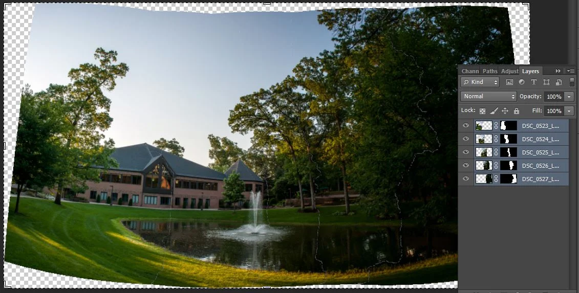
First, all you'll need is a decent camera and a steady hand.  Go out somewhere and start shooting.  Instead of shooting horizontally, hold your camera vertical and capture 4-5 shots while 'panning' across the subject.  Keep in mind, you're stitching each of these photos, so there needs to be a little overlap in each image you shoot.  I attached a screenshot below of the 5 images I captured for this panoramic.  I did these hand-held, but you can use a tripod.  

You'll see the 5 images I've taken using the 'overlap' method that I mentioned earlier.  Now, open Photoshop.  Go under File>Automate>Photomerge.


screen_2.jpg

Another window will come up.  It looks like this below.

screen_3.JPG

Click Browse and select all 5 images from your shoot.  Leave the layout on Auto, but make sure Geometric Distortion Correction is checked, then click ok.  Watch what happens.

screen_4.JPG

You'll see that it automatically stitched all 5 images into 1.  Each of them are on their own layer with a layer mask.  Now, your panoramic is stitched, but we still have some distortion from the lens capture.  This comes from the curvature in the lens itself on the camera or the way you were holding it at the time of capture.  It's easily corrected in Photoshop using the transform tools.   Flatten your layers into one, and I generally use the warp tool to normalize the image a little.  The final image can be seen below.


pano_original_1_low.jpg

The most tricky part is getting your shots right in the camera.  Most people's first instinct is hold their camera normal (horizontally and pan over) and shoot.  You can do this, but you're able to capture more of the surroundings if you shoot vertically.  Think about your depth of field.  You can also use this method for shooting vertical images, rather than wide panoramics.  In which case, yes, shoot horizontally, then pan upward or down.

More to come from JRDesign.  Stay tuned for more.  Have a great weekend folks.        

Why Squarespace Rocks

We've all struggled with web design, right?  How many times have you read lines of code, searching for the right tweak or the end bracket that you were missing?  And don't forget that backslash on the end.  I still don't fully understand cell padding, or why they even call it that.  Over the years, I experimented with different tools like Fireworks, Flash, Frontpage and Dreamweaver as solutions to online publishing.  Heck, I remember typing code in SimpleText on my old Mac when I first started trying to publish my artwork online.

As a designer and photographer, when you create something, you want to share it.  The easiest way to do that is the web.  I mean, using Blogger is easy, right?  I kept thinking, why doesn't someone make a tool like that you can use that eliminates all that frustration with web editing and just works?  I want to spend time shooting, editing and designing, not figuring out why my navigation bar won't align correctly.  I just wanted my site to look good, represent my work and be easy to update.

In late 2012, I began hearing more and more about an online site publisher called Squarespace.  As the positive reviews poured in, I decided to try it myself for a little while.  They offer a free trial period for 15 days and then you can pull the trigger on an annual or monthly subscription.  In under 15 minutes, my site was designed, published and configured in a way that looked great!  And the only reason it took longer was because I was indecisive about which images I wanted to use!  That was honestly the hardest part.  Editing and updating the site all of a sudden became a breeze.  Need a gallery or two? Let's do three, or eight!  No problem.  Want a blog?  Sure!  How about a link to your Facebook page?  Gimme something harder.  I know!  A page for selling products?  That's right...they do that too. It's all there.  Waiting.  One.  Click.  Away.

No more uploading files to a remote FTP server.  No more referencing your CSS in the right HTML file.  No more banging your head against your desk because your site only looks right in Firefox or Chrome and not in I.E.  No more aching head.  Did I mention that I wrote this blog post using their mobile app on an iPad?

They also have partnered with Smugmug. I'll get to why that's bathed in awesome in my next post. I was not paid to write this. I am simply trying to spread the word on good things I come across that make my life easier.

Want a great, contemporary looking site that will showcase your work or business?  For less then $10 a month, you can.  I'm 9 months in and I love it.  Try it for over 2 weeks free at www.squarespace.com.  Stop banging your head.  It's got to be hurting by now.  I'll be right here waiting for your celebratory fist bump.

squarespace-sitebuilders.jpg